


While completing my bachelors degree I found the perfect opportunity to implement UX Design Principles into the universities student portal website, for my thesis.
This case study will explore the mobile interface design of a university student portal platform (AOLIS), focusing on select pages of the mentioned website to improve the user experience for students when accessing this platform on their mobile devices.
PROJECT
Student Portal App Redesign
CLIENT
Adventist University of The Philippines
DATE
Jan – May 2023
ROLE
UX Researcher, UX Designer, UI Designer
The Research Phase
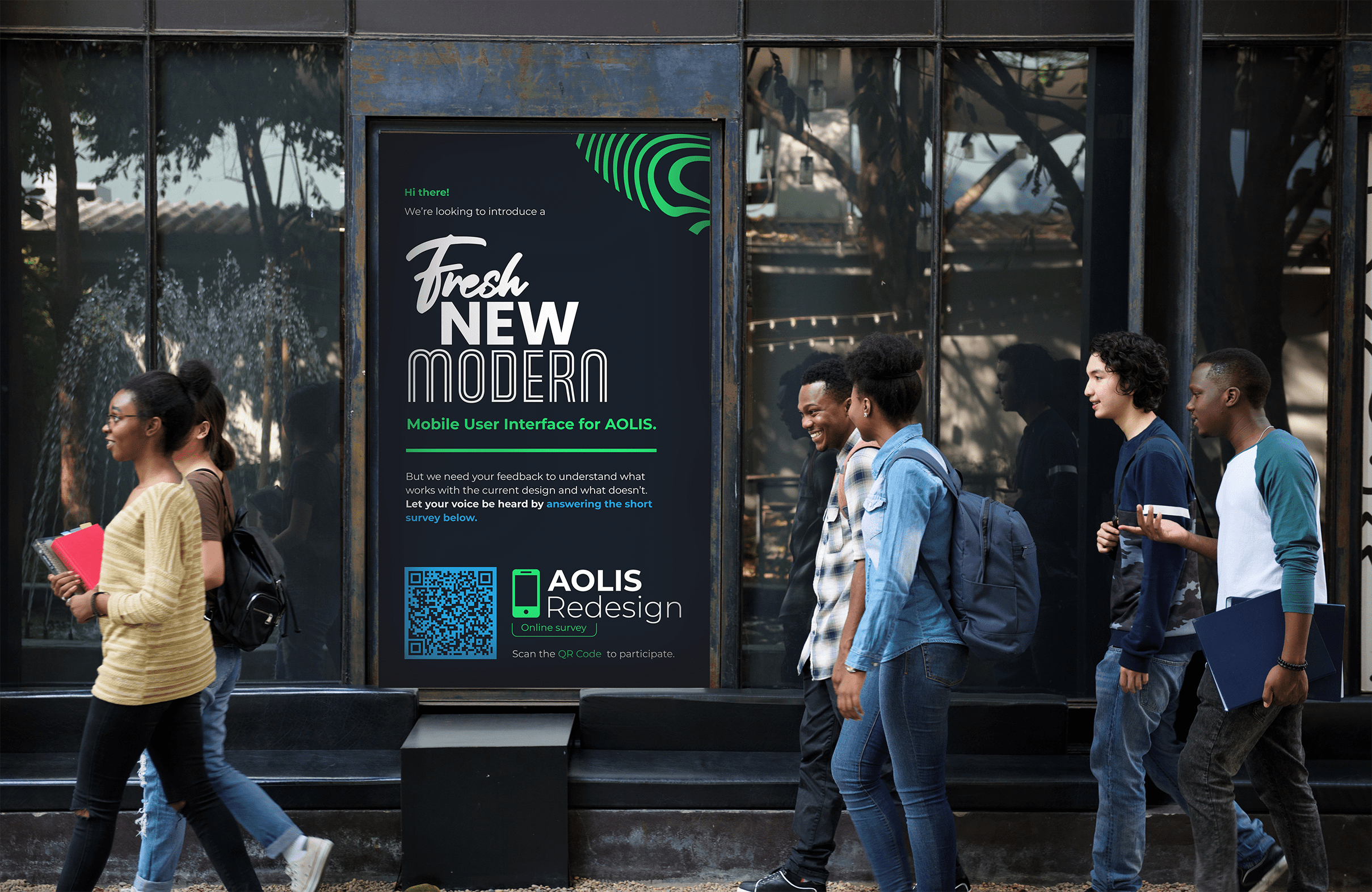
During my 4 years of study, the university student portal (AOLIS) is an essential part of student life. The website is used for the scheduling of classes, payment of tuition and processing of online forms. The issues I encountered over the years as a student was:
- The portal was not responsive for mobile devices.
- There was no notification system on the website.
- The navigation of the interface needed improvement.
- Tabular information when viewed on a mobile device required unnecessary scrolling.
- The UI design of the portal didn’t match the brand style of the university.
Hence I decided to redesign the student portal with an interface that is responsive for mobile devices. I focused on 2 user journeys. Mainly how users access the Grades and Finances page.
My research begun by understanding and identifying the core UX design principles in terms of:
- visual hierarchy and consistency
- user centricity and user control
- usability and accessibility
Next I created a survey which was distributed amongst the university students from each college. The survey would prompt students to evaluate the current mobile design of the student portal against UX design principles. In this way I was able to find out what pain points and positives the student portal has.
Survey participants
0
Colleges Participated
0
Students were given the following survey response options:
- Strongly Disagree – Verbal Interpretation – Very Poor
- Disagree – Verbal Interpretation – Poor
- Slightly Agree – Verbal Interpretation – Fair
- Agree – Verbal Interpretation – Good
- Strongly Agree – Verbal Interpretation – Very Good
Survey statements included:
- The AOLIS mobile user interface showcases the brand identity of AUP.
- The most important features of AOLIS such as the grades page stands out on the interface.
- AOLIS notifies users when there’s an update to the grades page.
- Mistakes can be easily corrected when using the AOLIS mobile user interface.
- Navigating pages within AOLIS is a comfortable experience.
- The visual design of the AOLIS mobile user interface is pleasing to the eye.
The Analysis Phase
When analysing the survey results the mean and standard deviation of the survey responses were calculated to determine the extent of the respondents’ experiences in the use of the current mobile interface.
Scoring System and Verbal Interpretation for the survey:
- 1.00 – 1.49 = Strongly Disagree/Very Poor
- 1.50 – 2.49 = Disagree/Poor
- 2.50 – 3.49 = Slightly Agree/Fair
- 3.50 – 4.49 = Agree/Good
- 4.50 – 5.00 = Strongly Agree/Very Good.
Visual Hierarchy and Consistency
It was discovered that users felt that the student portal had a fair representation of Visual hierarchy and Consistency.
User Centricity and User Control
It was discovered that users felt that the student portal had a fair representation of User Centricity and User Control.
Standard Deviation
0
Grand Mean
0
Slightly Agree
Scaled Response
Fair
Verbal Interpretation
Usability and Accessibility
It was discovered that users felt that the student portal had a good representation of Usability and Accessibility.
Standard Deviation
0
Grand Mean
0
Agree
Scaled Response
Good
Verbal Interpretation
When looking at the analysed data I found that the student portal had both positive and negative aspects to its design. Positive aspects being:
- The language used throughout the portal was understandable to users.
- It was discovered that the typography design of the student portal mobile interface was seen as legible, understandable, and readable by respondents.
- Finding information on the finances page was seen as an easy process.
On the negative side of things, users agreed that:
- The user interface requires unnecessary scrolling on the grades and finances page
- The user interface was seen as unappealing and did not resemble the brand of the university
- The user interface is not responsive for mobile devices.
- There is no notification system to update users whether there has been an update to their profile, online form submission, grades etc.
The Design Phase
When redesigning the student portal mobile interface, all design decisions were influenced from the results of the study and UX design principles.
Login Page
Since every user journey on the student portal starts with logging in, this is where the redesign process began. The proposed design adheres to various UX design principles such as keeping design elements consistent such as spacing, use of alignment, color and typography. The proposed interface also complements the “less is more” principle as it has less clutter than the current design. The color palette used clearly complements the university brand identity, emphasizing that the student portal is a product of the university. With the proposed design of the login screen, the visual hierarchy and consistency of the interface was improved. The visual aesthetics of the proposed design incorporated the university brand colors to improve the visual appeal of the design and make it more relatable for students.
Proposed design

Current design

Home Page
Respondents indicated that the most important features of the student portal do not significantly stand out on the interface. To rectify this on the home page, I focused on implementing a structured information hierarchy that was neatly organized. Pages were categorised into groups such as Featured, Student Life, Bible and Health. This was done to improve the visual hierarchy and consistency of the design, as well as the usability and accessibility. The categorization of pages will allow users to navigate through the student portal at a much easier level than at its current state. Addressing the survey data received of the student portal not notifying students of updates made to their accounts, a notifications page (indicated by the bell icon) has been added to the bottom-navigation of the interface, thus implementing the UX design principle of “feedback matters in design”.
Proposed design

Current design

Grades Page
According to the survey data, students agreed that the student portal interface requires unnecessary scrolling. This can be seen on the current design of the student portal as the tabular design for the grades extends far beyond the width of the mobile screen, which has a negative effect on usability and accessibility. The proposed design of the interface aims to improve this by grouping the most important information for each subject into a list format that extends vertically and adheres to mobile screen specifications, an influence of mobile user interface design. The most important information on the grades page can be easily seen the course codes, student GPA, subject names, teacher’s names and the provided grades. If the user wishes to see the additional information, it is possible by taping on the ellipses icon where a pop-up of the additional information can be seen.
Proposed design

Current design

Finances Page
When observing the current design, the account balance of the user is not clearly shown. This makes the interface and its content not easy to understand. This was corrected on the proposed design as the account balance is clearly centred and visible. The most important information for each transaction is now clearly seen on the proposed design. Whereas on the current design users would have to scroll left and right to view transaction information. The proposed design highlights each transaction amount as either green (crediting the account) or red (debiting the account), making it clear for users to understand when money is leaving or entering their account. The current designs fails to do this and the only way to know if an amount is credited or debited to the account is through the use of a “-” sign.
Proposed design

Current design

Conclusion
I believe the research successfully assessed a student portal against UX design principles and ultimately improved the current design with the proposed design. With the proposed design, students would be able to have an easier, time-efficient and more pleasant experience with the student portal mobile interface if it was tailored to their needs and devices. A mobile friendly interface allows users to access the platform while being on the move which in the end saves time.
This study has served its purpose and filled the research gap by identifying the shortcomings and positive aspects of the student portal mobile interface through the application of UX design principles, Gestalt principles, visual aesthetics, mobile user interface design and information architecture. The proposal of a redesigned solution will surely propel the platform into the right direction.
To take the design even further, I would conduct usability testing with the proposed design to gain more insight into how users would interact with this new design. In this way through iteration the design can thoroughly be improved.